Fazer for Minis, Identity and Packaging

Summary
End-to-end brand creation
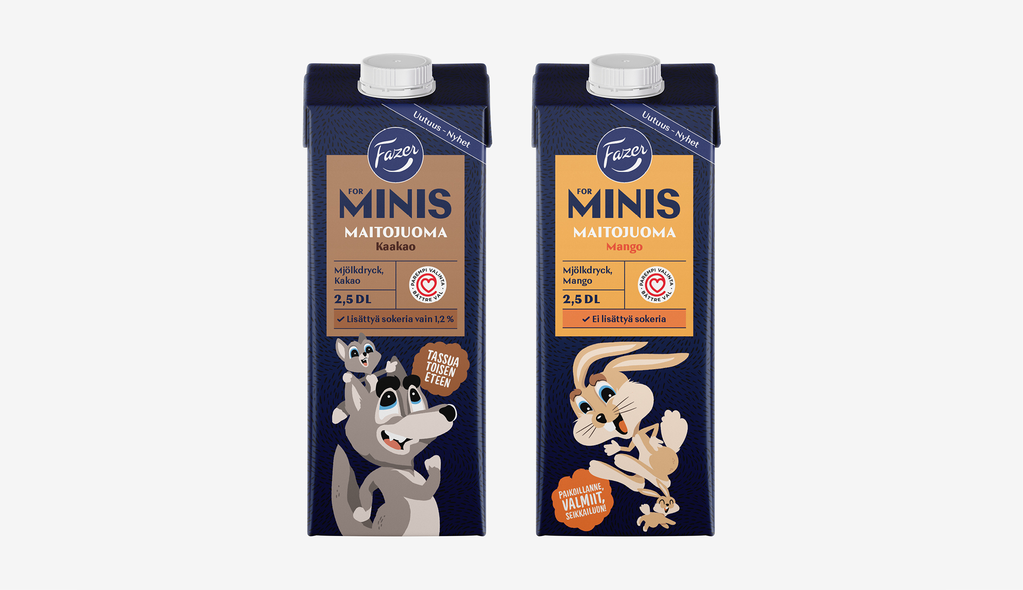
Within the two year customership Fazer for Minis – a family of healty kid's snacks – got a scalable visual system. This project included all phases of packaging development: consumer-studies, visual concepting and exploration, prototyping, iteration and final printed packaging. The project was done in a team of three, myself and a copywriter, supported by a creative director. My responsibilitites were in creating the visual identity, all illustrations, and print production. The overall success the project was the result of a very dedicated customer and our well working design-team.

My Contribution
Providing versatile design expertise
From my part, the underlining theme for this project was the extensiveness of needed skills. In the first phase of the project, my responsibilites were in iterating alternative approaches on the logo, color-scheme, layouts and typography. As the concepting progressed, it turned out that illustrations were becoming the key element of the packaging.
Creating the characters, their expressions, and interactions, was a project in itself. Being responsible in creating them, while acknowedging the project schedule, was intense at times. A particularly challenging moment occured about week before going to print. Due to recent consumer feedback, all characters needed to be revised once more. This hectic moment taught me that every design can be developed further if needed.
In the finalising phase all elements were fine tuned: font-sizes, characters, background pattern, and so on. Also working on the colors with the print house was especially important in this kind of product. Aftre the first three packagins were launched (cereal, chips and milks), the product-family expanded with rice-cakes and juices in the following years.
Deliverables
- arrow_forward Visual Concepting
- arrow_forward Visual Idenitty
- arrow_forward Illustration
- arrow_forward POS-Materials
- arrow_forward Print Production